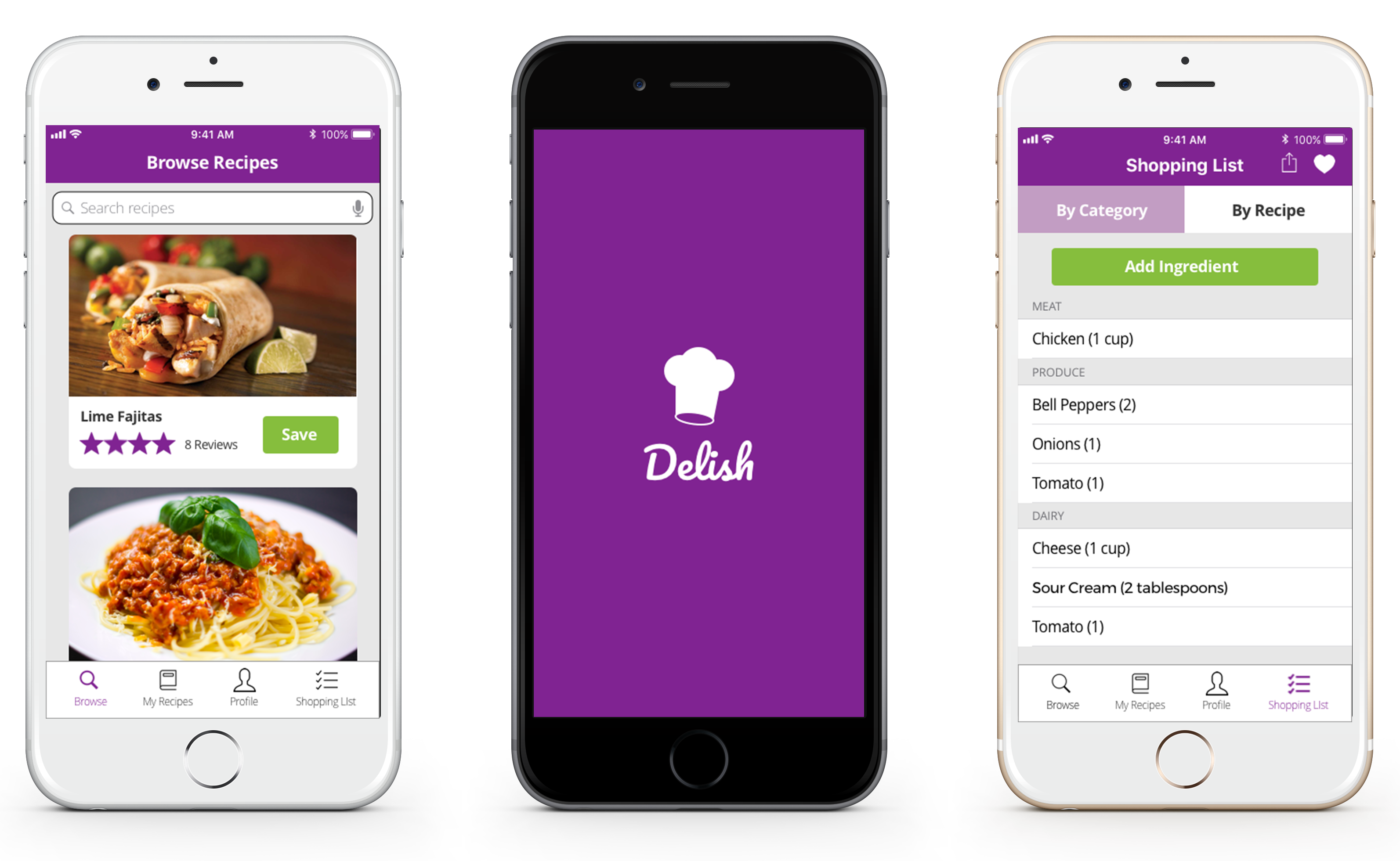
Delish is a mobile app that makes meal prep easy. Find new recipes and make grocery lists from your phone.
Overview
The Problem
Meal planning is an extensive process that often involves searching through multiple resources for new recipes and writing down shopping lists by hand. It takes too much time.
The Solution
Delish aims to make this process easier by providing an easy-to-use user interface that allows you to seamlessly browse and save recipes, and create new shopping lists.
The Process
Getting to Know the Users
Creating a Survey
I started with a user survey to figure out what the biggest pain points are for users when creating grocery lists and what features needed to be included in the app. Some of the most significant findings included the following:
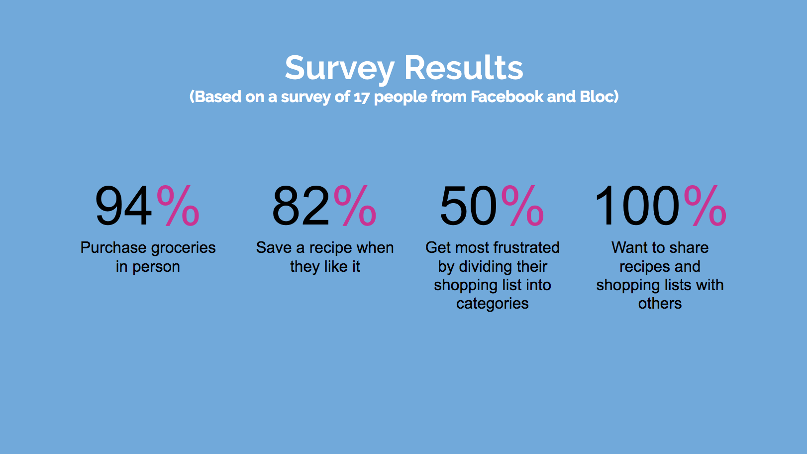
Top 5 Biggest Survey Takeaways
- Users want a mobile app they can take to supermarket
- Ease and accessibility were the most commonly referenced reasons for what users like about their shopping list creation tools (with pen & paper + notes app being the most common)
- Access to reviews and a wide variety of food were the most listed requirements for a recipe finding app
- Users want flexibility to add ingredients to their list as they think of them
- Users need to be able to share recipes and shopping lists with others
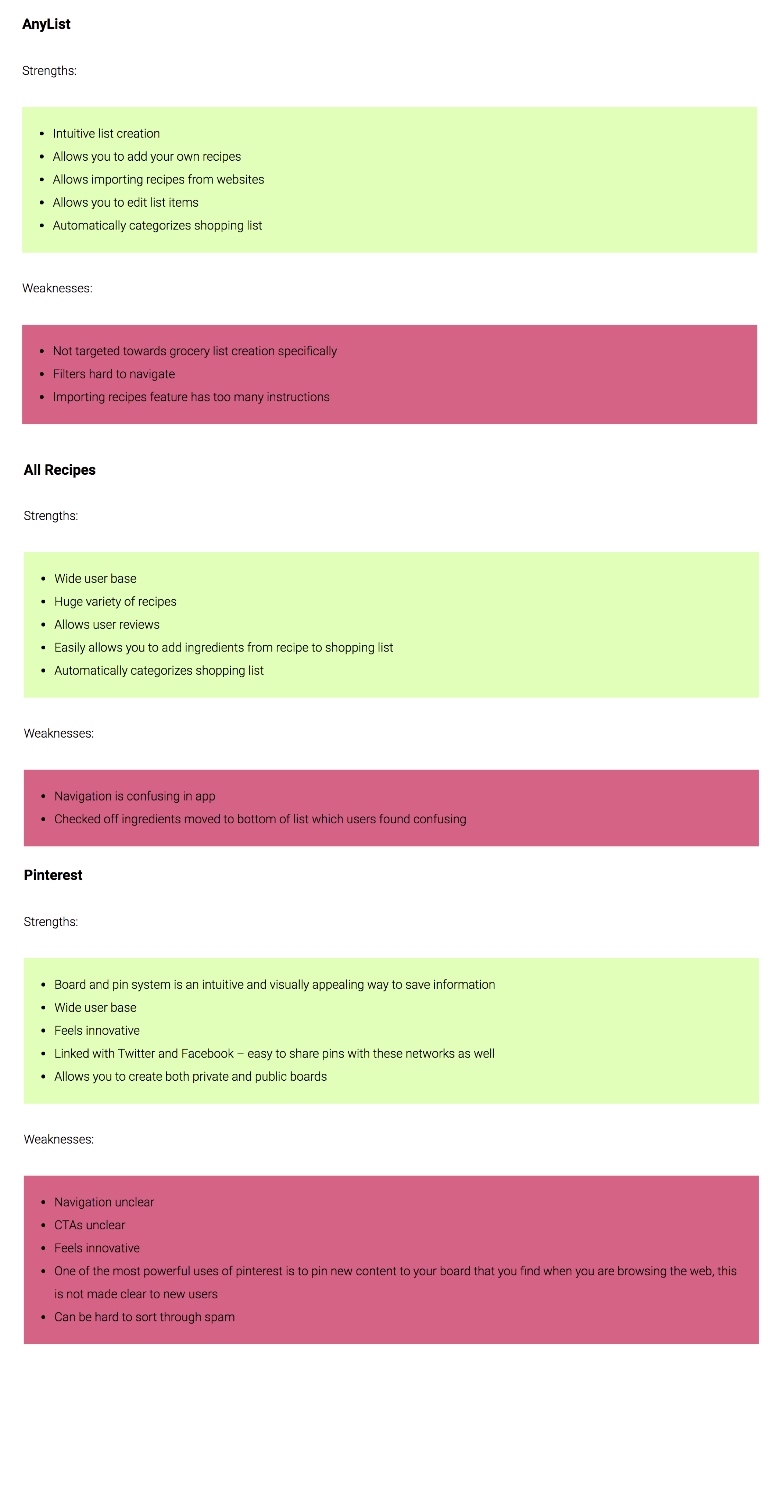
Competitive Analysis
I analyzed my survey results to see which competitors my survey participants were using, and some of the most popular apps were AnyList, AllRecipes, and Pinterest.
The final Delish product takes the strongest elements from these competitors. It uses a saving and category system that is similar to Pinterest, recipe to shopping list conversion from AllRecipes, and a list creation system that takes elements from AnyList.
All Recipes
Strengths:
- Wide user base
- Huge variety of recipes
- Allows user reviews
- Easily allows you to add ingredients from recipe to shopping list
- Automatically categorizes shopping list
Weaknesses:
- Navigation is confusing in app
- Checked off ingredients moved to bottom of list which users found confusing
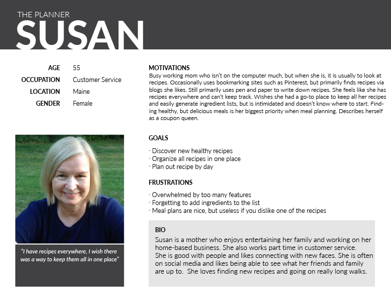
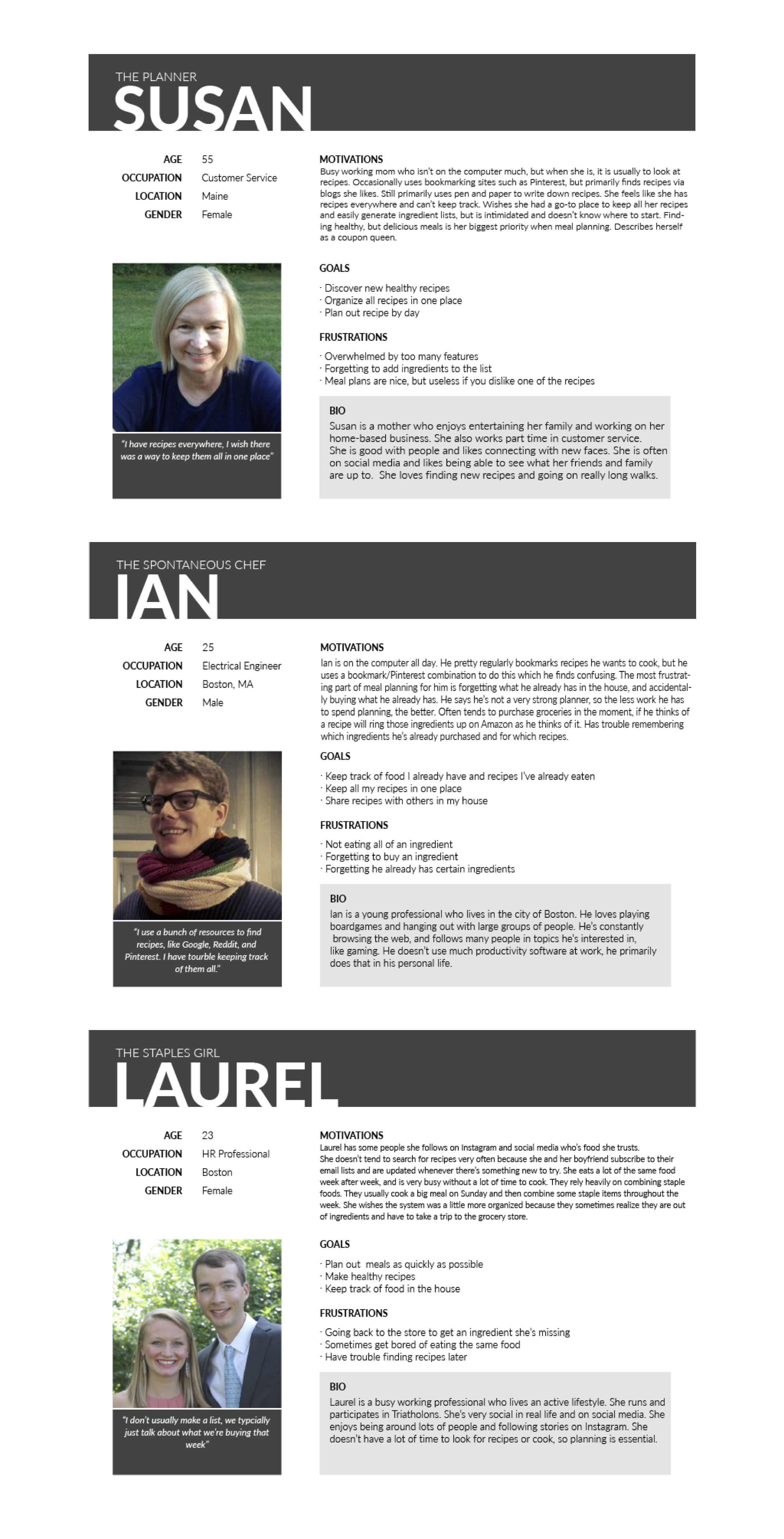
User Personas
After reviewing my survey results, I interviewed participants to come up with personas to help understand the target audience:
The Planner - Needs to find recipes that appeal to picky eaters and easily go back and find what worked. Relies heavily on ratings from others.
User Stories
My user survey and personas helped me to figure out which features to include and what interactions a user would have with my app:
- User finds new recipes
- Users saves recipes they can easily come back to later
- Users creates new shopping list using saved recipes
- User saves shopping lists they can easily come back to later
- User shares recipes and shopping lists with others
- Users rates recipes and views the ratings of others
User Flows
Based on my user stories, I sketched out what some potential user flows would look like:
Find a New Recipe
 (1).png)
Add Ingredients
 (1).png)
Save Recipe
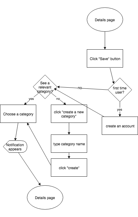
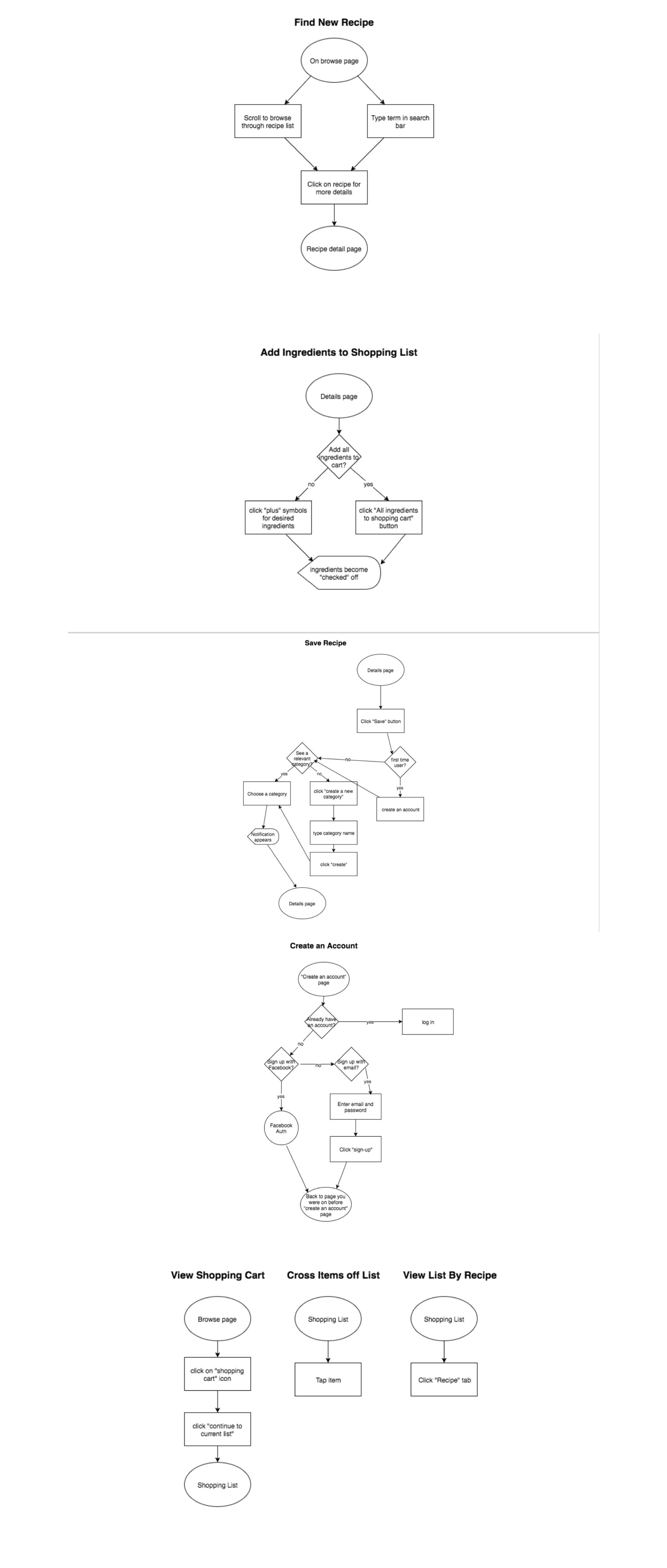
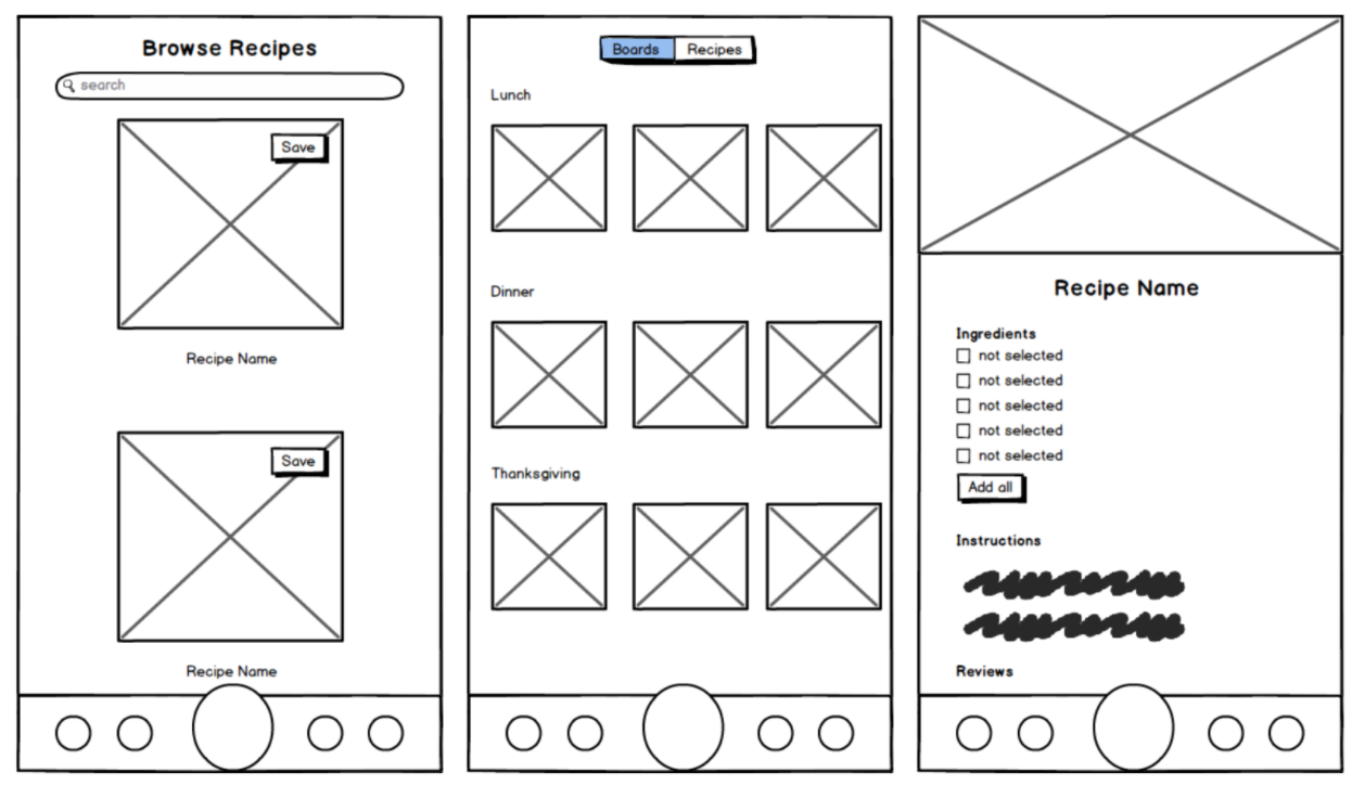
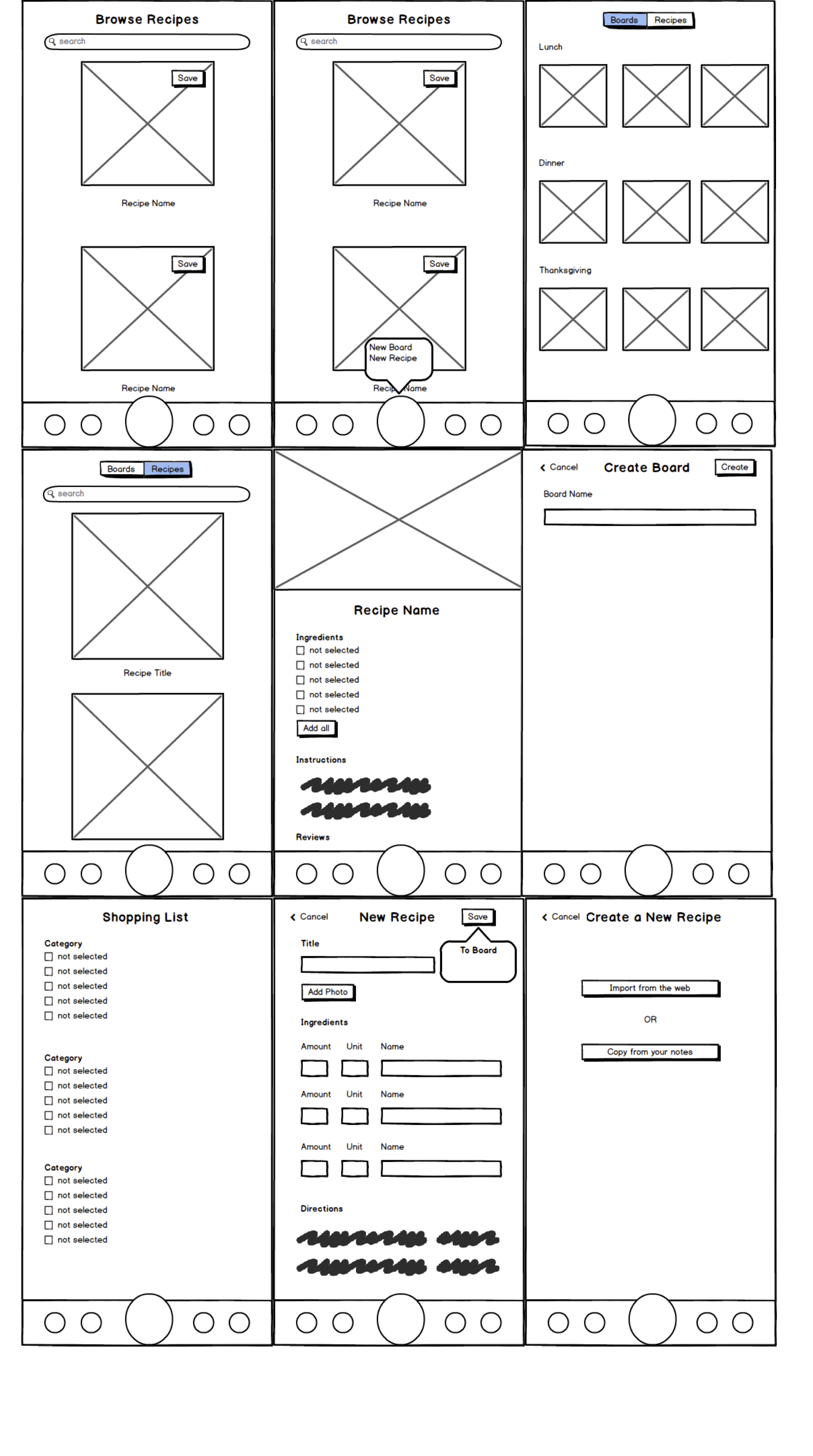
Wireframes
I sketched out some initial wireframes by hand and ran them by user testers to make sure they made sense. Then I transferred them to myBalsamic:
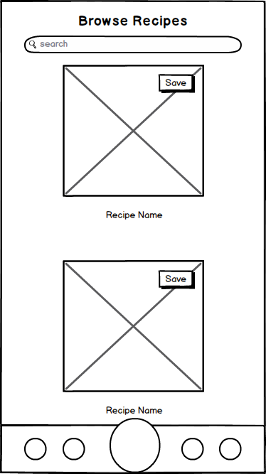
Some of the features seen in these wireframes got removed as I continued to work on the project. For example, initially, this app was going to allow users to add their own recipes. This would have added complexity to the user interface because the ability to add recipes means that recipes must be editable. If recipes are editable, this would interfere with the user/rating system since you shouldn't be allowed to edit a recipe that already has multiple user-ratings. I didn't want to have to distinguish between user recipes and the general user base recipes. Additionally, adding the option to manually add recipes can be distracting from the primary focus of the app.
Wireframe Iterations
(Based on feedback from my mentor and observing feedback as 3-4 people interacted with the wireframes):
- Removed "add a recipe" button and associated functionality
- Added an option to view shopping list by recipe or category
- Added a shopping list history section
- "Create a board" changed to "create a category"
Branding
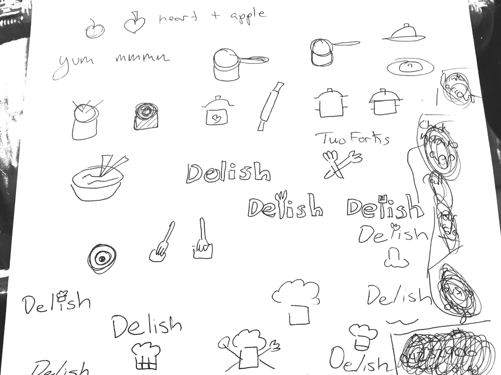
Initially called Grocery Master, it was at this point I changed the name of the app to Delish after doing some mind-mapping and figuring out what emotions I wanted the brand to convey.
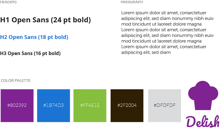
I also created a style guide. I chose colors that reduce stress (trying to make shopping list creation fun), and inspire creativity. I chose Open Sans for its neutral, yet friendly appearance, and because it was designed to be optimized for mobile interfaces. A light Montserrat body text pairs nicely with Open Sans and is easy to read.
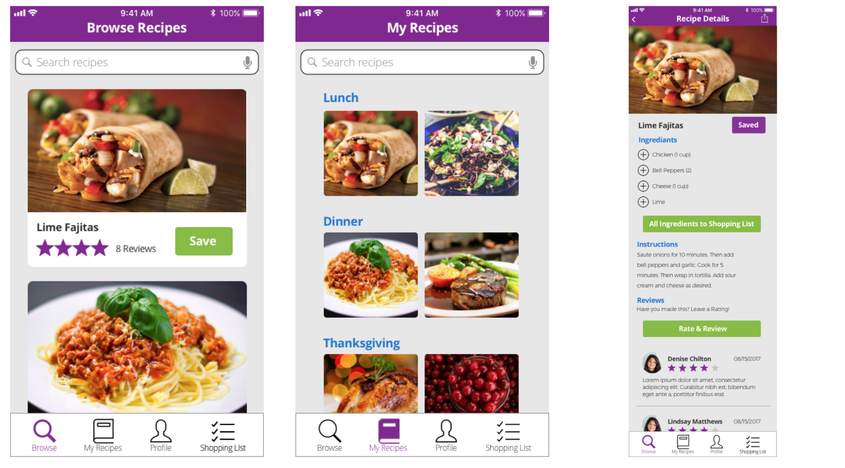
High Fidelity Mockups
With my branding and initial wireframes complete, I moved on to high fidelity mockups, and turned these into prototypes to get some user feedback.
User Testing Results
Interview Takeaways
I ran 3 approximately 30-minute sessions with users who had not seen the app before, and asked them to complete a list of tasks, and came up with the following takeaways:
- Users were confused about the existence of a dietary preferences settings section since I had not told them they could change these when they opened the app for the first time
- It was unclear to users if saving a recipe or shopping list had been successful
- Users found the heart-shaped save button to be misleading
- Users could not find the saved shopping lists
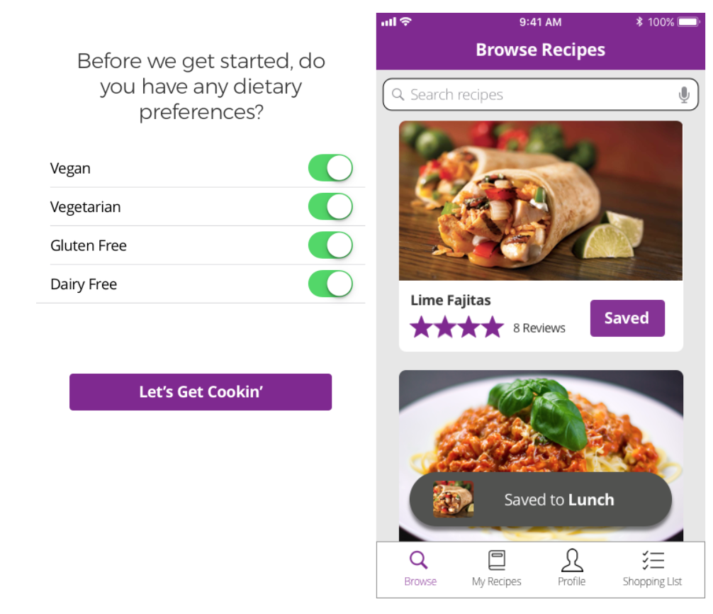
New Additions Based on Interview Takeaways
- Added a dietary preferences page to onboarding process
- Created "saved" notifications
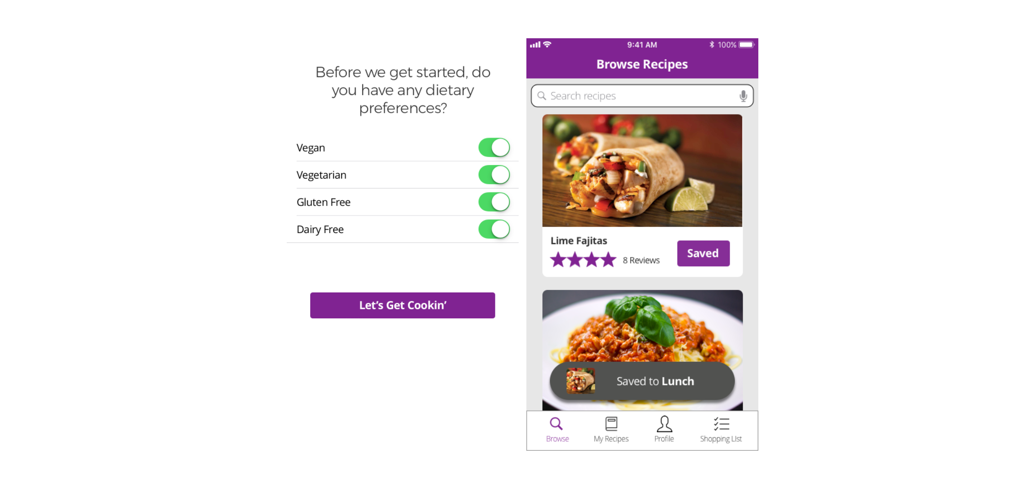
New Additions Based on User Tests
Based on the feedback from my user interviews, I created several user tests, and made the following changes based on their results:
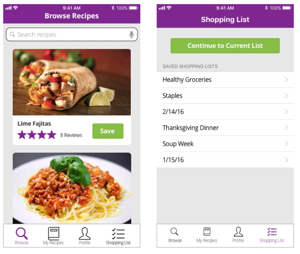
- Changed the heart button to a "Save" button
- Changed the location of "Saved Shopping lists" To the "Shopping List" tab from "Profile"
Prototype
Reflections
I did a lot of user testing for this project from the very beginning, which definitely helped me from having to go back and redo my work later, and from projecting my own biases. Even informal user testing was incredibly helpful. After I made my first initial sketches, I asked - does this make sense to you? How would you expect to interact with this navigation?
My competitive analysis and user testing on competitors products also served me well. This project arose out of my own frustration with finding recipes and making shopping lists. My goal with Delish was to make the process as mindless as possible, and to create an interface that avoided any distractions. By testing features from competitors to see what worked well and what didn't, I feel that Delish was able to avoid some common weaknesses with similar types of apps.